
Project Description

01 Overview

The Problem
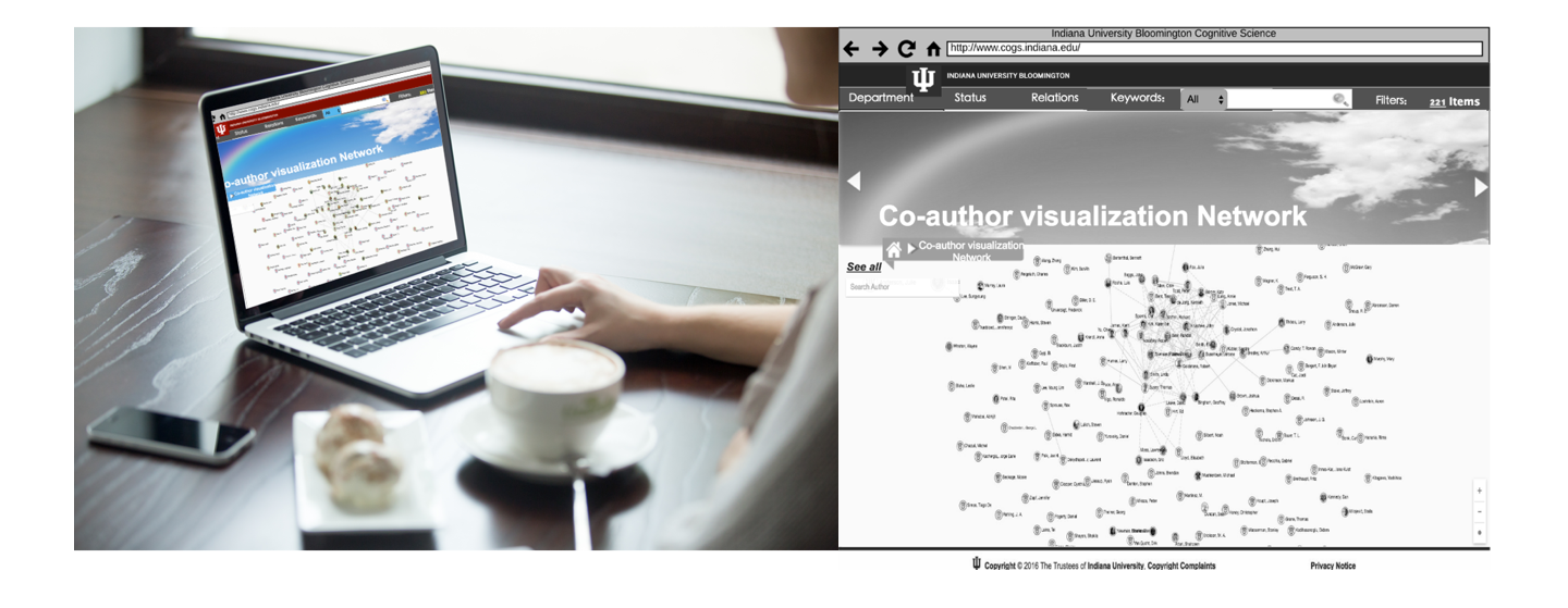
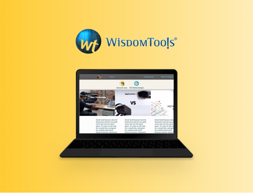
Co-author visualization network is a product that was built by IU Cognitive Science for many years, and the department put an amount of money into it every year; somehow, people actually seldom knew it or used it, and few people know there is such a product even exists.
The Challenge
Improving the UX, especially the functionality.
This project was started several years ago; the database is updated every year; however, the visual look is outdated and not functional for users to search and explore deeply. The department staffs complained the old version for a long time. The user experience of the platform needs to be improved in both the visual side and functional side. If we want to improve the functionality, we need to also rethink the whole Information Architecture of the website.
Breaking through the time and budget limitations.
I worked in a pretty small team, and we had 3 projects that needed to do at the same time. We only left this project for two months at most. As the only UX designer in the team, I need to make sure every small step that I took should be valuable and possible to be implemented by the developers at the end. The limitation of time and budget was also a big challenge for user research and usability testing.
02 Old Product Analysis
Getting to know the product
To know whom we are designing for and the product features is always important and in order to understand what causes a problem and to make a redesign proposal, I firstly supposed to analyze the entire user workflow as a raw user, then to find out the breakdowns that behind it. It helped me to understand the IA as well as the communication-related features of the product.
User Workflow & Touch States
From Breakdown to Breakthrough
Using contextual design in Human Computer Interface
Contextual design provides a structured method for gathering and analyzing contextual data. During the system analysis, the sequence model (one of the contextual design methodology) shows the detailed steps performed to accomplish each task important to the work. It shows the different strategies people use, the intents or goals that their task steps are trying to accomplish, and the problems getting in their way. It is useful to take the sequence model’s idea and turn it into this UX case. Through it, I can find out the breakdowns of the whole system and then to effectively think about the way to improve the product’s usability.

Breakdown Analysis: Flow Model of Search Path
03 User Research
Getting to know the users
After analyzing the product, I started to do the user research. I first decided to understand how my coworkers thought about this product. I worked with one project manager, two software developers, and one databases administrator to uncover the insights about both the previously completed work and the future work. We also translated ideas into features that address customer behaviors and motivations to make sure those future design plans are realistic and can be completed by the assigned date. Therefore their opinions could be my firsthand useful information.

I can still impressively remember that at the very beginning of my internship, when we were doing concepts translation, I asked my team “what is your ideal version of this website? What do you guys think could be improved,” however no one had the clear solutions in their mind, but finally everybody ended with the same answer: “to make the website user-friendly.”
User Interview
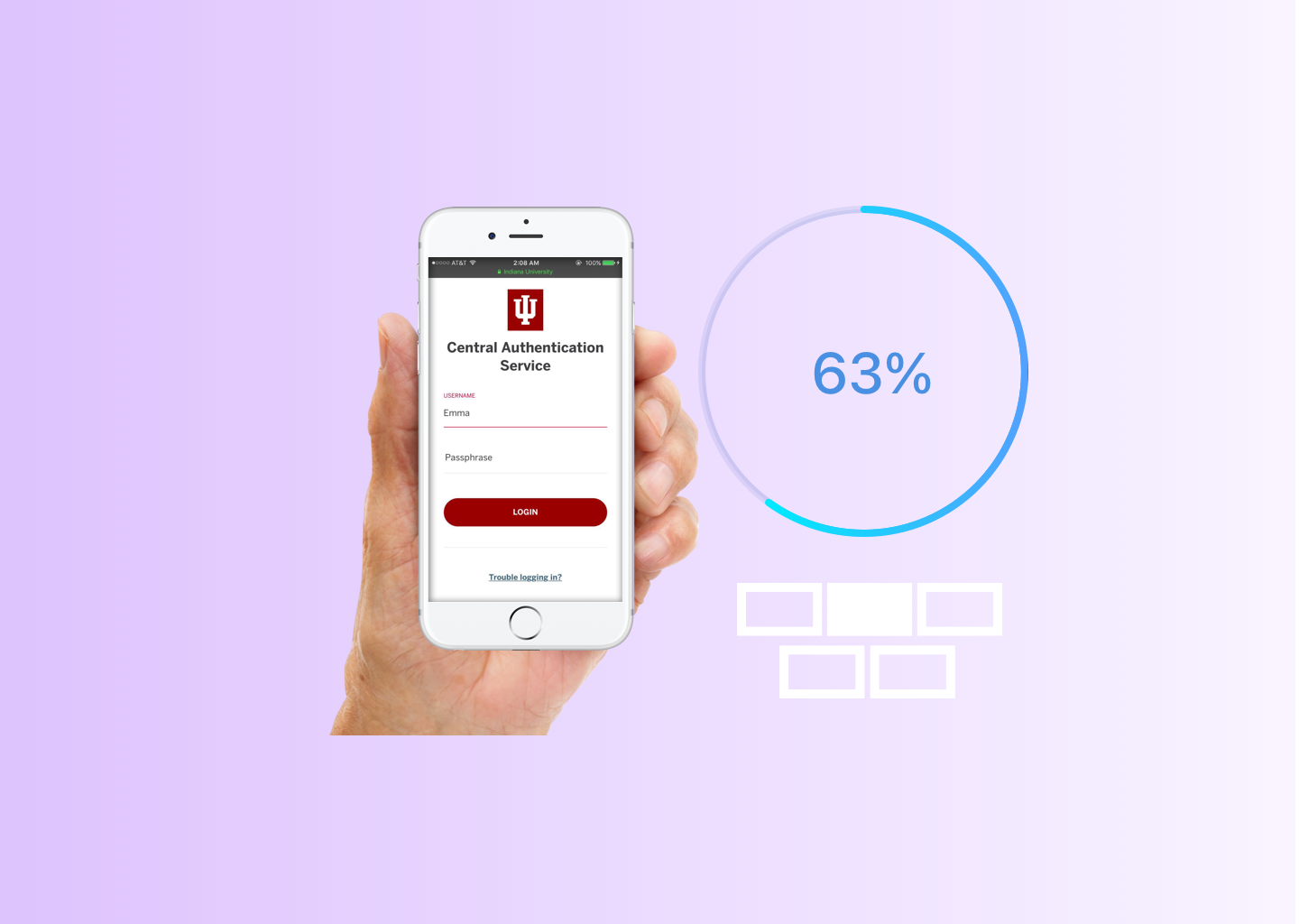
Base on the product analysis and my coworkers’ views; I then decided to do a user interview to get a thorough understanding of users’ thoughts. I find 12 users to do this interview: 6 students, and 6 university staff. The interview was mainly focused on the demographic information, product first impression, problem-solving preference, and suggestions.

Usability Testing
After collecting some impressed information from the interview, I decided to do a usability testing for the existing product. I wished I could get some raw data of the product interface that could reflect the exact insights directly from the users. It is useful for me to dig out the problem deeply and to help me come up with a solution in the future to make the product to be attractive enough that people want to look at it.

Base on the results I got from the interview, I made the same 12 users to consistently do the usability testing. The testing was mainly focused on the features of the way to search, navigation, buttons to touch, and co-author relationship understanding.
Analysis:
I asked for the problems they faced when playing the website, and
I found that:


From the environmental observation I recorded that: 5/12 people failed to search and gave up finally. The reasons to fail are interesting:
- Wrong spelling (by search bar)
- Failed to recognized the author by the profile picture (by co-author visualization network)
- Tried several time and rush to go
I found that some impatient people did NOT want to try again once they have failed twice. I totally understand that, since You can have the most beautiful website in the world, but people will leave immediately if they are unable to figure out how to navigate your site quickly.
Final Problem Statement
Identify the problems from IA side
- The previous version was too old for users to browse.
- Some inundated information was still showing on the visualization network page. (Like the anniversary celebration advising)
- There was only one search bar for finding author by names, but it could not meet the requirement for students to search author by department name, fields, etc.
- Students might feel confused about the author-relationships between each scholar, because the relationship map lacks description.
- Both university officials and students were not satisfied because the old website was not attractive.
- Lack of information to describe listed author’s position.
- No place to show all listed authors.
Insight
Make an improvement according to these findings
So, what makes a website user friendly? This was the question I asked myself after figured out the product problems, and it was also the question that my engineering teams asked me during our regular meeting. By doing research, I finally focused on these five aspects of a user-friendly website:
learnability, efficiency, memorability, errors, and satisfaction.
Combining these 5 aspects, standing by the information architecture side, I finally gave myself an essential aim to make a website user friendly that is, to improve the “Satisficing”.
What is “Satisficing”? [Satisficing = Satisfy + Suffice]
When faced with a decision, we can either take the time to find the best answer, or we can decide to settle for a ‘good-enough’ answer, and get on with our lives. Psychologists call this latter strategy satisficing, a combination of the terms ‘satisfy’ and ‘suffice.’ In the information architecture field, “satisficing” means settling for something we know may not be the best possible choice, but that at least meets our essential needs.
Satisficing = Quickly Meet Users’ Main Needs
Two Facts
Unless faced with life-changing information, most site visitors won’t read all of the content provided but settle for a “good-enough” answer. Better sorting and clearer writing satisfy users without exhausting the limited time they’re willing to spend on a website.
Users often leave Web pages in 10-20 seconds, but pages with a clear value proposition can hold people’s attention for much longer because visit-durations follow a negative Weibull distribution.
Redesign Solution
After finishing all of the user analysis and defined project scope with my project manager and developers, I came up with my redesign solution:
an IU version of “Google Scholar”, but it has a different layout that is visually appealing.
Solution Keywords:


04 UX Improvement
Improved IA and Findability
Redesign the information architecture
Home page wireframe redesign

Improved the Discoverability
Redesign the interaction buttons

Improved the User Flow
Redesign the new way to search

05 User Scenarios
Imagine this…
You are a graduate student who has the potential thought of pursuing a computing-related ph.D degree and wants to find one academic advisor. At brunch, you received an email from a cognitive science program about one phd student who will have a final dissertation defense next week. You have heard that the Cognitive Science program contains a lot of science fields and many scholars were active during the recent years.
You wonder what departments the cognitive science program includes,
and also want to know which professor has most recent publications in your field. You go to the Cognitive Science home page, and see one button that leads to “Co-author Network”.
Well, you do not want to spend a lot time on it, but it does not hurt to have a little peek with your curiosity. So you click a the button.

A webpage opens up, and you can see a visual network of IU authors. The webpage is dynamic and you can zoom in and zoom out to see the detailed co-author relationships, authors’ personal information, and department information.
The website interaction leads you to explore more, deeper and deeper… You learn about the dynamic co-author visualization and the fancy interactions are all customized to your motivation. So you plan to take a little bit more time and explore on.
Well, I kinda like this website…I would really like to explore more.
Case 1 :
Overwhelming? Try the “Search bar”, let the “See all” lead you to search authors by alphabet.
It is a bit overwhelming for you to find one of your intentioned professor only through his profile picture. You noticed that there is a search bar next to the visualization network and also a “See all” button. You guess it should be another way to find your professor. Then you click the “See all” button, and you find all author’s name listed here by alphabet for you to quickly find the author of whom you already know the name.
I want to find my favorite professor Yong-Yeol Ahn, too many authors showing on the webpage here… Hmmmm, overwhelming already.
Wait, I find a “See all” button! Should that work?

After finding your professor on the list, you decide to check his detailed information. You click his name on the list, and the page jumps to his personal page.
Case 2 :
Find the author you know by “Face”.
Through the local navigation bar, you go back to the home page. You suddenly recognized one professor you ever meet before. Curiosity drives you to click his profile picture circled with a green color. (At this time, you can already know, the green color stands for faculty, because a colored explanation is just right down the page.) Suddenly all non-related authors change their color lighter, only related co-author show up with a deeper color, and at the same time, one clear relationship map lights up. You can clearly see his social group and also find his brief information in the left pop up information box.

You notice there is another yellow button on the left information box that says “Show Relations”. You click that button, and another pop up window jumps out with the clear co-author information on it. This time, you can even see each co-author’s position status, faculty, alumni, grad student or undergraduates.
You click into the “profile,” and it leads you to the professor’s personal page.
Case 3 :
Know more info from navigation and filter, search whatever you like by “Keywords”.
After playing with that all, you still have questions in your mind. “What are all the departments included in the Cognitive Science Program?”, “What are the publication topics related to cognitive science? I only have ‘computer science’ in my mind…” Let me do a search.Click edit button to change this text.
Uhmmm, I am feeling curious about this program right now…Seems like it includes many science fields. What are they? I think “CS” is cognitive science field?

You notice an “All” next to the search bar, by clicking it, you jump to a page with all listed keywords of the publication using “Hashtag#”. And when you are typing the “keyword” in the search bar, an associating inputting history shows up to make your search easier.

“Department”, “Status”, “Relations” and “Keywords” can help you narrow your search, and your search history will be saved on the upper right side. Everytime you select a new item, the page will be fresh a time. There is also a calculatorto count your result each time on the top right. You can compare which field has more scholars at IU.
All filtered authors are listed in the page using the brief information box. If there are more than one page of the filtered authors, you can directly see their names on the left side “Quick list”. You can either click the information box to to author’ personal page, or click “see relations” to check out related co-author without going back to the co-author visualization network page.

06 Adjustment
After half of the time past by, our developer realized we might not implement our redesign because of programming limitation and time limitation.
See the previous solution video prototype
Then we decided to turn to the backup version design which has less changes but still keeps the key features. The backup version focused on:
- Smallest change, big impact
- Leave more space to D3 graph
- Shortest time with less code
- Make new features attractive
- Keep the searching function clear and easy
The Final Product


07 The Launch
As I already showed due to the time limitation and complicated back-end stuff, we finally cannot realize all the functionalities of the planned redesign solution. Instead, we implemented one simplified version product to make our original design idea come true.
Check out the video, or you can also visit our website http://www.indiana.edu/~cogsci25/graph.html and play with this fancy product.
The Final Product Video Recording
Also check it out by click here.